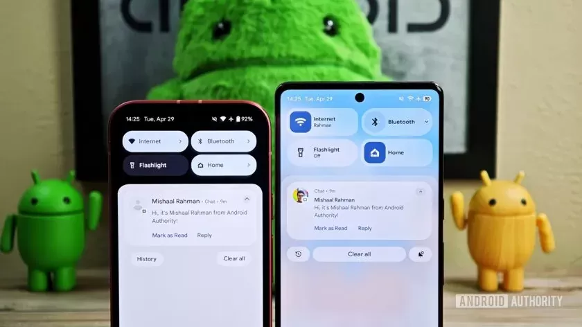
Google's Android 16 Beta 4 has landed with minimal user interface changes, leaving some users underwhelmed. However, beneath the surface, the tech giant is quietly laying the groundwork for a sweeping aesthetic evolution. Slated for full reveal during the upcoming Google I/O 2025, a fresh iteration of Material Design — dubbed “Material 3 Expressive” — promises more vibrant visuals, refined layouts, and a deeper embrace of transparency and blur effects. Although these enhancements remain disabled in Beta 4, early glimpses offer a preview of Android’s next visual identity, positioning Google to reclaim design leadership in the increasingly competitive mobile OS landscape.
Android 16 Beta 4: A Quiet Release Hiding Bold Intentions
With the rollout of Android 16 Beta 4, expectations for a significant visual transformation were tempered. The final beta build arrived largely resembling its predecessor, Android 15, sparking disappointment among users hoping for a radical redesign. However, Google appears to be saving its visual innovations for a more strategic moment: its annual developer conference, Google I/O 2025.
Behind the scenes, Android 16 is shaping up to be a springboard for a refined design philosophy, integrating several experimental UI changes that have been quietly embedded — but not yet activated — in the codebase. These latent elements are likely precursors to the new “Material 3 Expressive” design language.
Material 3 Expressive: A New Chapter in Android Visual Design
Google’s design evolution is about more than new icons or typography. Material 3 Expressive represents a shift toward immersive, emotionally resonant interfaces — a direction that mirrors global trends in user experience design, where subtlety and softness increasingly replace stark minimalism.
Key elements expected to define the new design language include:
- Dynamic background blur across UI surfaces
- Segmented status bar icons, offering clearer visual feedback
- More colorful indicators, such as battery icons that shift based on charging state
- Refined typography, including a slightly bolder and larger text clock for better legibility
These visual cues not only enhance aesthetics but also improve usability, allowing users to access key information at a glance with reduced cognitive load.
The Status Bar and Quick Settings: A Functional and Visual Refresh
Among the most apparent UI enhancements previewed in Beta 4 are updates to the status bar and Quick Settings panel. The new design features:
- Redesigned Wi-Fi, mobile data, 5G, and airplane mode icons with increased visual segmentation and clarity
- A more vibrant battery icon, which changes color based on charging or power levels
- A bolder, more legible clock font that aids quick readability
The Quick Settings and Notifications panel — long combined in Android’s interface — is being refined rather than overhauled. While earlier reports hinted at a complete split between the two, Google appears to be doubling down on a more organized combined layout, which includes:
- Resizable tiles
- Streamlined toggle buttons for connectivity
- A revamped brightness slider
- Expanded blur backgrounds for visual hierarchy and depth
Though subtle, these adjustments indicate Google’s focus on making interactions feel more fluid and visually polished.
Why Google’s Visual Strategy Matters
The decision to withhold major UI changes from the stable release of Android 16 may be strategic. By building anticipation around Material 3 Expressive and teasing enhancements through controlled beta features, Google can ensure a smoother transition while collecting feedback from developers and power users.
From a business standpoint, the move signals Google’s response to mounting design competition from Apple’s iOS and Android forks like Xiaomi’s HyperOS and Samsung’s One UI — both of which have embraced modern, blur-heavy aesthetics with significant success.
Google's willingness to re-engage in the design race indicates a recognition that user interface polish can be a competitive differentiator, particularly in premium segments where visual finesse is equated with innovation.
Looking Ahead: Android’s Design Future at I/O 2025
With Google I/O 2025 on the horizon, expectations are mounting that the company will officially debut Material 3 Expressive and clarify its vision for Android’s next visual era. If recent leaks and developer comments are accurate, Android 16’s stable release may serve as a transitionary canvas — relatively static now, but primed for transformation through incremental quarterly platform updates.
Whether Google will activate the full suite of hidden design features this year remains uncertain. Still, what’s clear is that Android’s visual identity is on the cusp of a rebirth — one rooted in expressiveness, customization, and cultural nuance.
Comments