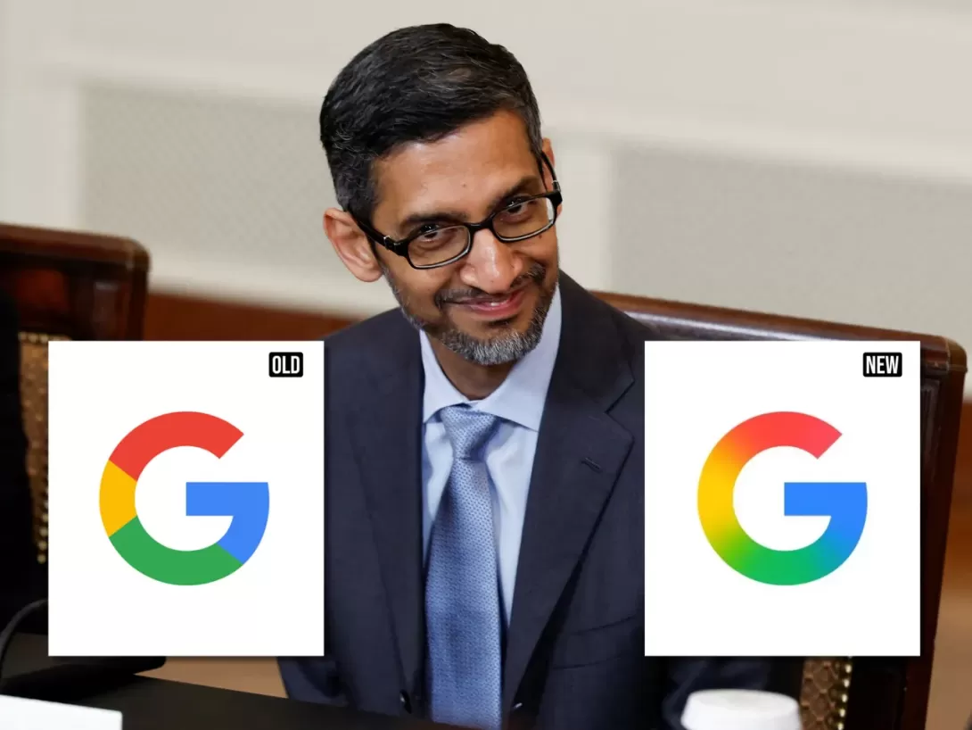
For the first time in nearly a decade, Google has unveiled an updated version of its iconic 'G' logo. The redesign, which introduces a smoother gradient effect, reflects the company’s growing focus on artificial intelligence and its evolving visual identity. This update marks the first change to the logo since 2015, when Google switched to the now-recognizable circular design. While reactions to the update have been mixed, the subtle shift in design signals a broader transformation within the tech giant, aligning with its AI-first approach and product innovations. The update is already visible to select users, with a broader rollout expected soon.
A Subtle Evolution in Google's Visual Identity
Google has refreshed its famous 'G' logo for the first time in nearly ten years, marking a shift towards a more dynamic and vibrant aesthetic. The update, which was first seen by iOS users and select Android beta testers, brings a gradient effect to the logo, replacing the four solid color segments—red, yellow, green, and blue—with a seamless blend of the same hues. This change may appear subtle, but it carries significant meaning, aligning with Google's broader visual strategy and emphasis on innovation, particularly in the realm of artificial intelligence.
The redesigned logo retains its circular shape, a feature that has become a symbol of Google’s brand identity since its last significant logo overhaul in 2015. At that time, the company transitioned from a lowercase 'g' on a blue background to the familiar multicolored 'G' in a sleek, modern typeface called Product Sans. The new gradient design, however, adds a contemporary softness to the logo, in keeping with current design trends and reflecting the company’s evolving brand narrative.
The Role of AI in Google's Visual Update
The most striking aspect of the new logo is its gradient effect, which provides a more fluid, organic appearance compared to the sharp lines of the previous design. This shift is not merely cosmetic; it mirrors the company’s strategic pivot towards artificial intelligence. The gradient motif, already seen in the branding of Google's Gemini AI and recent updates to the Search app interface, signals the company’s desire to project a more integrated, futuristic identity.
This visual change reinforces Google's AI-first strategy, signaling to users and the tech industry alike that the company is positioning itself at the forefront of AI innovation. As Google increasingly leans into AI technologies, it is only fitting that this transformation is mirrored in its logo—an iconic symbol of its brand. The gradient logo thus becomes more than just an aesthetic choice; it is a visual representation of Google’s ongoing evolution as a leader in AI development.
Impact on User Experience and Brand Perception
Although the new design has yet to be fully rolled out across all Google products, early reactions have been mixed. Some users have appreciated the refreshed, softer look, seeing it as a positive step towards a more modern and user-friendly interface. Others, however, have poked fun at the subtlety of the update, feeling that it lacks the boldness of previous design changes.
Nevertheless, the refreshed 'G' logo is already visible to select iOS users through the Google Search app, with Android devices soon to follow in the beta release of version 16.18 of the Google app. The logo will also appear on Pixel devices, but it’s worth noting that the traditional wordmark remains unchanged across most Google platforms, including the web. As the update is expected to roll out more widely in the coming weeks, it will be interesting to see how users respond as the new design makes its way across various platforms and devices.
Looking Ahead: Will the Logo Redesign Extend to Other Products?
While the updated logo has been integrated into the Google Search app and select Android devices, it remains uncertain whether this new gradient style will extend to other flagship products, such as Google Chrome or Google Maps. These applications still use the original solid-color logo, and it’s unclear if the refreshed logo will make its way to these platforms.
However, the logo update is a clear indication that Google is embracing a unified, modern aesthetic that aligns with its future ambitions in AI and digital innovation. Whether the gradient logo will become ubiquitous across all Google services or remain exclusive to certain platforms remains to be seen, but its current presence in key Google apps signals the company’s commitment to a more cohesive and forward-thinking visual identity.
Conclusion: A Quiet Yet Meaningful Change
Google’s decision to refresh its iconic 'G' logo is a significant, albeit subtle, step towards reinforcing its brand’s evolution. The integration of a gradient effect not only enhances the logo’s aesthetic appeal but also reflects the company’s ongoing shift towards artificial intelligence as a core component of its identity. While some users may have mixed feelings about the update, the new logo serves as a visual cue of Google’s ambitious AI-first strategy. As the company continues to innovate and evolve, this design update is likely to be just one of many steps in refining both its product offerings and its visual representation in the digital age.
Comments